Choosing the Right Paint Colors for a Calm Home
Transform your home into a sanctuary with soft neutrals, tranquil blues, and muted greens. Master undertones, lighting, and room-by-room palettes for calm.
Understanding the Psychology of Calm
Creating a soothing home begins with color psychology. Our brains interpret color through memories and associations, and certain palettes naturally support rest. Soft, desaturated hues with gentle saturation and moderate value feel more peaceful than loud or high-contrast schemes. Think of tones found in nature: muted greens, misty blues, stone grays, and sandy beiges. These colors mimic the biophilic palette, which can quietly signal safety and stability. Warmth matters, too. A touch of warmth in an otherwise cool scheme prevents sterility, while a hint of coolness in warm spaces keeps the palette from feeling heavy. Aim for low contrast between walls, trim, and large furnishings so the eye glides rather than stops. If you love color, choose softened versions: a dusty sage instead of a vivid emerald, a whisper blue rather than a bright azure. Your goal is harmony, not monotony. By honoring how colors influence emotions, you set the stage for a consistently calm home.
Light, Space, and How Color Behaves
Before choosing paint, study natural light and how it shifts throughout the day. Cool, indirect light can make colors read crisper and bluer, while warm, abundant light deepens and softens them. Room size and surface finishes also influence perception: small spaces often benefit from balanced mid-tones that reduce glare, while expansive rooms can handle a broader range without feeling stark. Consider the light reflectance value (LRV) to gauge how bright a color will appear; higher LRV bounces more light and can feel airy, but too much can lead to a sterile, reflective quality. The temperature of your bulbs matters as well—warmer light flatters earthy hues, while cooler light complements gentle blues and grays. Notice flooring, countertops, and upholstery, which can pull hidden undertones forward. The more you observe orientation, glare, and diffusion, the easier it becomes to predict how a color will behave in real life rather than on a small swatch.
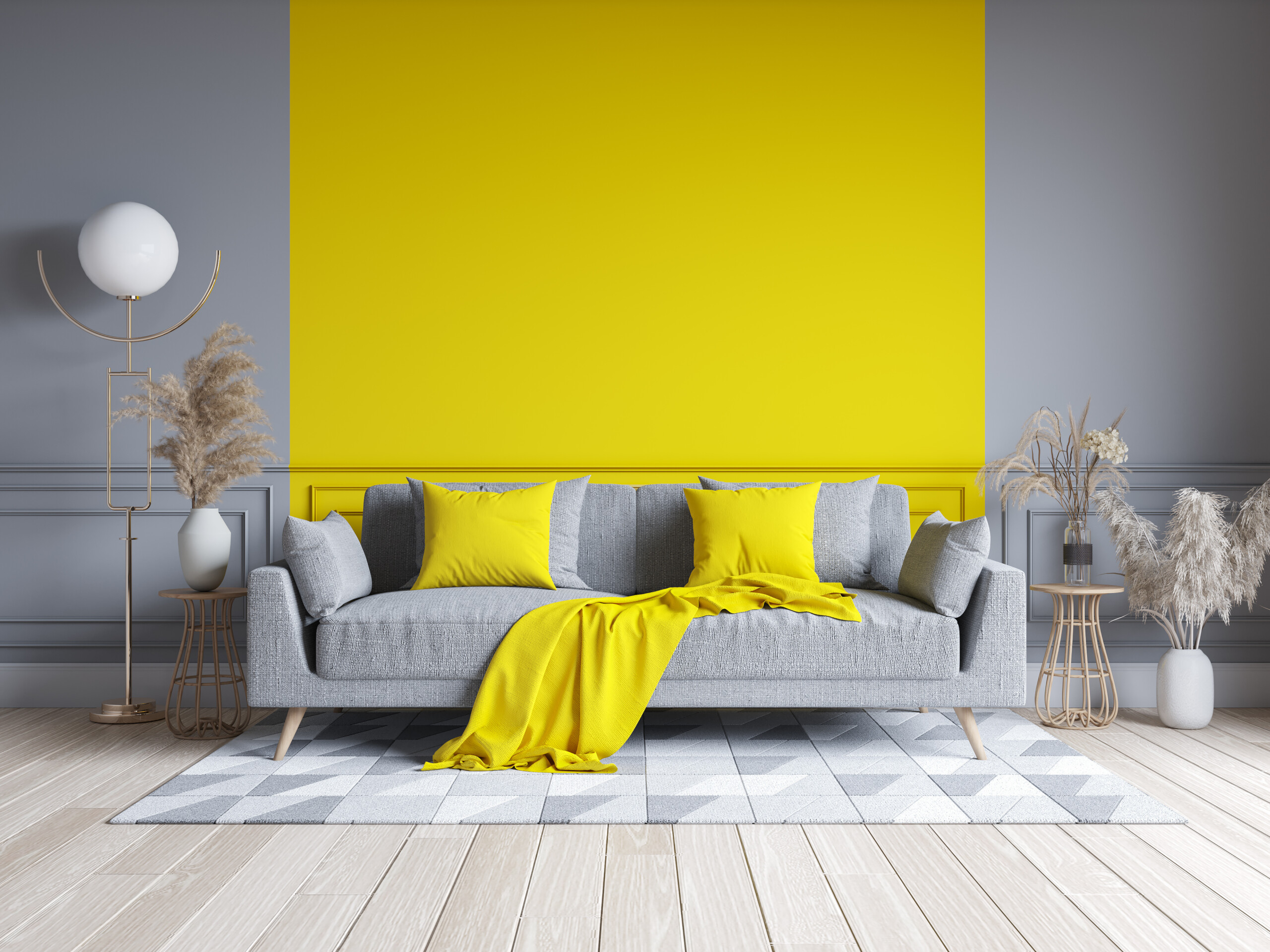
Curating a Gentle Neutral Base
A serene home often begins with a versatile base of layered neutrals. Off-whites, soft ivories, warm greiges, mushroom taupes, and feather-light grays become quiet backdrops that let texture and light take the lead. A cohesive neutral envelope creates continuity from room to room, reducing visual noise and supporting relaxation. Consider slight shifts in depth rather than dramatic color jumps—one wall a tint lighter, the hallway a shade deeper—so transitions feel intentional. Pair the walls with subtly contrasting trim and ceiling tones, keeping the differences restrained to avoid harsh edges. Neutrals are not boring when enriched with natural materials: rattan, linen, wool, pale wood, and matte ceramics add gentle contrast and tactile interest. If you crave more warmth, blush-tinged beiges or clay-leaning taupes can feel sunlit without becoming overpowering. Use this neutral foundation to host art, plants, and soft furnishings, allowing those elements to provide character while the paint quietly supports a calm, collected mood.
Mastering Undertones and Temperature
Two colors labeled gray may look wildly different once you notice their undertones. Some lean blue or green, others drift toward violet or brown. These subtle notes can clash with existing finishes or feel surprisingly bold under certain lights. Identify undertones by comparing potential paints against a true white card and nearby materials. Warm undertones complement honeyed woods, brass, and terracotta, while cool undertones flatter concrete, chrome, and slate. If your fixed elements mix temperatures, bridge them with flexible hues such as greige, putty, or softened sage. Keep contrast gentle: extreme warm-cool pairings can feel restless in quiet spaces. Repetition helps, too. Echo undertones in textiles, artwork, and accessories to reinforce harmony. When in doubt, select colors with balanced, muted undertones that adapt gracefully to changing conditions. By prioritizing balance and testing in context, you reduce surprises and cultivate a palette that stays calm across rooms and throughout the day.
Choosing Finishes, Sheens, and Texture
Beyond color, finish and sheen shape how a room feels. Low-sheen matte and velvet-matte finishes diffuse light, minimize surface distractions, and read especially tranquil on large wall expanses. Eggshell offers a touch more durability while keeping reflections soft, making it a popular choice for living areas and bedrooms. Satin and semi-gloss deliver higher reflectivity, ideal for trim and doors where a crisp outline is useful, but consider whether the added shine introduces visual busyness. In calm spaces, reserve pronounced sheen for small accents. Texture also contributes to serenity. Gently variegated finishes, like subtle limewash effects or brushed mineral looks, can create depth without strong pattern, encouraging a soft, cocooning atmosphere. In high-traffic areas, prioritize cleanability with washable low-sheen formulas to maintain that diffusion over time. The right combination of sheen, texture, and color ensures surfaces work together, shaping light in ways that support comfort rather than competing for attention.
Accents, Contrast, and Room-to-Room Flow
A peaceful home benefits from carefully measured accent color and mindful flow. Instead of dramatic contrasts, aim for tonal steps within the same family, allowing the eye to transition smoothly between spaces. Use deeper hues strategically to zone areas—perhaps a softened charcoal in a reading nook or a muted marine on built-ins—creating a focal point without overwhelming the senses. Keep trims consistent to anchor continuity, and let hallways or transitional zones act as palette bridges with understated, adaptable shades. If you love pattern, choose organic, low-contrast motifs in textiles rather than busy wall treatments. Complementary materials—warm woods, woven baskets, and greenery—tie everything together, reinforcing a calm narrative. Metallic accents should be quiet and cohesive, leaning brushed over mirror-bright. Above all, maintain similar undertones across rooms so every doorway feels like a gentle exhale. When accents support rather than compete, your color story reads as one serene, connected experience.
Testing, Sampling, and Living With the Choice
The calmest colors are confirmed through patient sampling. Paint large swatch boards or wide sections on multiple walls, applying two coats over a neutral primer. Observe them through morning, afternoon, and evening daylight, then under your artificial light. Move furnishings into place; fabrics and floors will nudge undertones. Eliminate obvious mismatches, then sit with finalists for a few days to sense how they influence mood and energy. If a color feels nearly right but slightly off, adjust depth—one step lighter or darker often solves it. Prioritize patience over speed; the right shade will reveal itself as you live alongside it. Once painted, keep a small labeled jar for easy touch-ups and note sheen and formula for future reference. Maintain walls gently with soft cloths to preserve the finish. Over time, refresh calm with subtle changes in textiles and greenery, safe in the knowledge that your paint provides a stable, harmonious foundation.