Color Confidence: Pairing Hues Like a Pro
Master color mixing with foolproof formulas, from complementary contrasts to tonal dressing, and build outfits that look polished, modern, and intentional.
Palette Foundations
Color confidence begins with understanding the building blocks of a palette. On the color wheel, hue is the family a color belongs to, value is how light or dark it appears, and saturation is the intensity. These three variables shape how shades interact on clothing. Warm tones, like tomato red or buttery beige, radiate energy; cool tones, like icy blue or charcoal, feel calm and sleek. Notice the undertone within garments: olive reads warm, slate reads cool, and some colors are balanced enough to function as chameleons. Build outfits with neutrals to ground brighter pieces, letting the eye rest while a featured hue sings. Black, white, grey, navy, tan, cream, olive, and chocolate are versatile anchors. When you can define the role of each piece in terms of hue, value, and saturation, mixing becomes systematic rather than guesswork. The more you train your eye on these qualities, the easier it becomes to predict which combinations look elevated and intentional.
Contrast and Balance
Striking outfits rely on measured contrast. You can create drama with value contrast by pairing light with dark, such as ivory against espresso, or with temperature contrast, like cool cobalt against warm camel. Saturation contrast is another sophisticated trick: energize muted taupe with a vivid coral accessory, or soften a bold emerald suit with a dusty eucalyptus shirt. Keep proportions in mind with the classic 60-30-10 framework: a dominant color, a secondary support, and a precise accent. Balance high-impact hues with visual weight from structure and fabric; a sharp blazer tempers an electric skirt, while a fluid blouse softens punchy trousers. If two colors compete, add a bridging element in the same family or neutralize with black, navy, or cream. Aim for cohesion over chaos, ensuring each color has a job to do so the entire look feels curated rather than crowded.
Neutrals That Work Hard
Treat neutrals as style multipliers, not afterthoughts. Black, white, grey, navy, beige, taupe, olive, and chocolate create a flexible framework that supports nearly every hue. Explore texture to keep neutral outfits dimensional: combine matte cotton with subtle sheen from satin, or add nubby knits, suede, and polished leather for tactile interest. A charcoal trouser paired with a soft heather sweater and a glossy belt is technically tonal, yet reads rich and layered. Select two hero neutrals aligned with your undertone; navy and camel flatter many, while charcoal and ivory feel elegant and adaptable. Use pattern as a neutral when its palette is muted and consistent, such as fine pinstripes or micro checks. These elements calm bold pieces and tie disparate colors together. With considered neutrals, outfits become modular, easy to remix, and effortlessly polished morning after morning.
Monochrome With Depth
A monochrome look is an instant elevation move when executed with depth. Rather than repeating the exact same shade, build tonal dressing within one family, playing with value shifts and texture mixing. Imagine a suite of blues: inky trousers, slate knit, and sky-toned overshirt, finished with a navy loafer. The harmony feels luxe because the eye moves across shadows and highlights. Structure also matters; a crisp silhouette prevents monochrome from feeling flat. Vary fabric qualities to avoid one-note outcomes: ribbed knits, airy poplin, brushed wool, and subtle luster all contribute nuance. Add a whisper of contrast through accessories that echo the palette, like a steel watch with cool tones or a tan belt for warmth. Monochrome dressing is efficient for busy mornings and travel, yet never boring when you layer thoughtfully and let material, proportion, and finish provide the storyline.
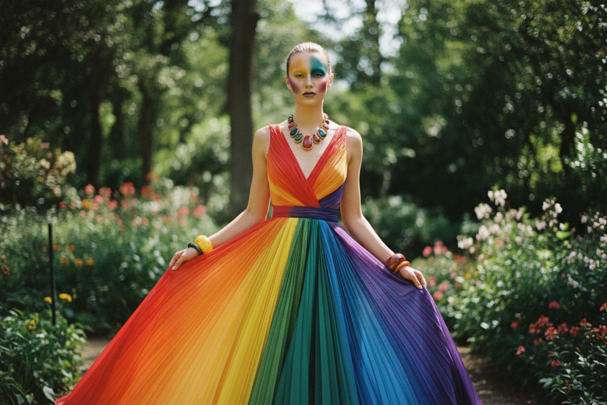
Harmonies: Complementary, Analogous, Triadic
Color harmonies offer reliable pathways to striking combinations. Complementary pairs sit opposite on the wheel and deliver lively contrast; think violet with yellow-based camel, or teal against rust. Keep one hue dominant and the other in accent form to maintain polish. Analogous schemes unite neighbors on the wheel, such as blue, blue-green, and green, creating fluid transitions that feel sophisticated and serene. Triadic combinations balance three equidistant hues, yielding playful energy when treated with restraint. To keep triadic outfits wearable, lower the saturation of two colors and let one act as the vivid star. In all cases, consider proportion and fabric: bold colors look more refined in tailored shapes or matte finishes, while glossy textures can read louder. Echo a tone in a print, shoe, or bag to weave the palette together. Harmony is not about perfection; it is about intention, hierarchy, and mindful repetition.
Prints, Patterns, and Texture Harmony
Color pairing extends beyond solids. With print and pattern, identify the background color first and match it with your base pieces to create an instant link. Then, pull one accent shade from the print for accessories or a layer. Mixing patterns works best when you vary scale and share at least one common hue. Stripes with micro florals or checks with abstract dots feel modern when their values and undertones agree. Treat texture like color: glossy satin reads brighter than matte cotton; corduroy and tweed add visual depth similar to a muted shade. Metallics often function as refined neutrals, especially in footwear or small leather goods, bridging cool and warm palettes. Consider familiar workhorses like denim, leather, and knit as chromatic tools; their finishes, washes, and grains influence how hues appear beside them. When texture, pattern, and color align, outfits feel layered, cohesive, and artful.
Undertones, Lighting, and Context
Your personal undertone influences which colors flatter most. Warm undertones often glow in earthy olives, terracotta, and creamy ivories, while cool undertones shine in berry, cobalt, and crisp whites. Neutral undertones can borrow broadly from both families. Test by holding fabrics near your face in natural lighting and observing clarity, contrast, and how even your complexion appears. Jewelry can guide you too; gold often complements warmth, silver flatters coolness, and mixed metals can signal versatility. Context matters: bright office spaces favor mid-value and muted hues that avoid glare; evening settings can handle richer saturation and plush textures. Consider mood and message as well: calming blues project steadiness, while dynamic reds communicate energy. None of these cues are strict rules; they are starting points. Aim to refine a personal palette that suits your environment, lifestyle, and taste so your wardrobe consistently supports the image you want to project.
Color Capsules for Real Life
A focused capsule accelerates dressing with confident color. Start by choosing a base of two to three neutrals that work across settings. Add an accent family of two related hues, like teal and sea green, for easy harmony. Finally, select one pop color to energize looks. Build outfits using repeat and rhythm: echo a hue in a scarf, shoe, or frame to unify top and bottom. Keep silhouettes simple so color does the talking, and invest in versatile layers that transition across temperatures. Track what combinations you actually wear and refine your capsule accordingly. Practical care matters too; wash brights with like shades, treat stains promptly, and be mindful of dye transfer with saturated pieces. Rotate accessories to refresh familiar formulas. When your closet is edited around purposeful color roles, you eliminate decision fatigue, strengthen personal style, and dress with effortless assurance every day.